Landing Page
Landing Page Guide
Hero Image or Video
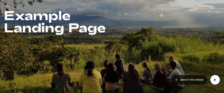
The landing page title appears at the top with an image or video behind it: this is the hero.
It shows a random image from the same group (group=me) tagged with “Hero” and the page title. If it doesn’t find anything tagged with the page title, it shows an image tagged with “Hero” from this group.
You can show a hero image, or a video from Vimeo or YouTube.
To change the hero image or video, go to the Dashboard > Images in this group.
Add a new image to this group. Please upload an image at least 1600 x 480 px.
Make sure the image is JPG/JPEG format, not a PNG.
Tag the image with hero and (optionally) tag with the page title, to show a specific image on a page.
If you tag a few images with hero then a random one will appear when you open the page.
To show a video, add a Vimeo link to the video on the right hand side of the editor. Copy and paste the Vimeo video URL. The image is always necessary, even with a video, in case the video fails to load.
To edit the title, go to the toolbar Page Details > Edit Page Details and change the page title.
Introduction
The introduction is the first editable section of the page. Click Edit Page to edit.
The introduction is a short summary and appears in large font. You can add longer, smaller text below the introduction.
Light Blue Grid
Next up, is a colored box with a heading on the left, and two column of text on the right.
Edit the page and click on the text to edit. Click the green + button to add more rows.
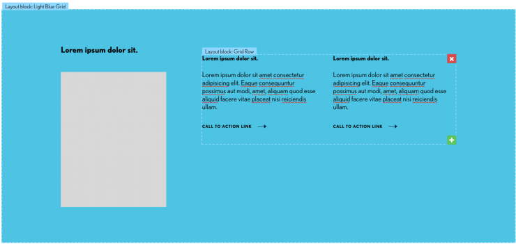
Note: it’s possible to change the color behind the text to a set selection of colors. This requires editing source code.
Areas 1 - 9
You can add text or widgets to these areas. Some examples of widgets you can add:
To add a widget, go to Insert > Widget and select a widget.
To add a layout block, go to Insert > Layout Block and choose a layout block style.
By default, you’ll see the events widget 2021 Events Row, Wide . It shows up to 4 upcoming events from this group. If you prefer not to show events, you can delete this widget.
Center Image or Video
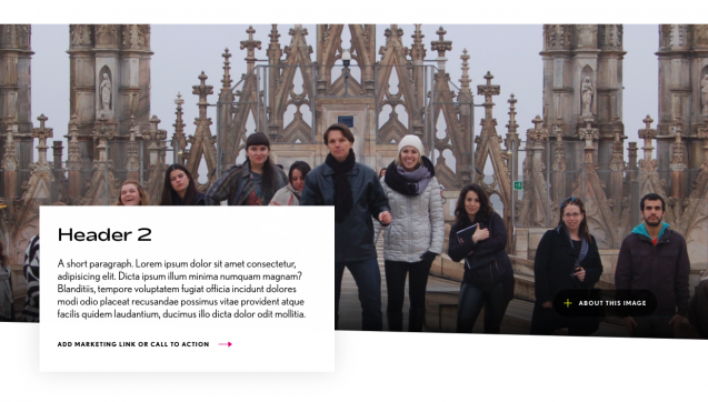
Lower down the page, there is another full-width image from this group tagged with center.
If there are a few images tagged center, then a random one will appear. Please upload an image at least 1600 x 480 px.
To show a video instead of an image, add a new image, and paste the url to a video on YouTube or Vimeo in the right hand side of the image editor. The image is necessary, in case the video fails to load.
The text on the left hand side is editable. Edit the page to change the header, paragraph and link.
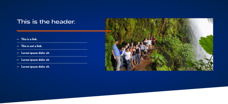
Related Links and Image
Edit the page to change the header or add links, or an image. The heading is hidden automatically if you leave the links empty.
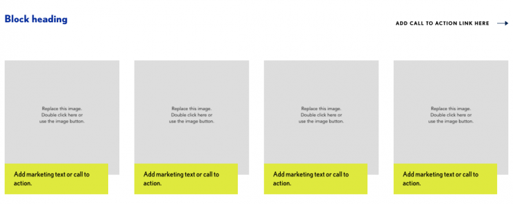
Images 4-across
The next area has a heading, link and 4 images. Add marketing text or a call to action in the yellow area. Adding a link inside the yellow area will make the whole image go to that link.
Panels
Next up, is a colored box with three panels, each with an image, heading, text and a link.
Edit the page and click on the text to edit. Click the green + button to add more panels.
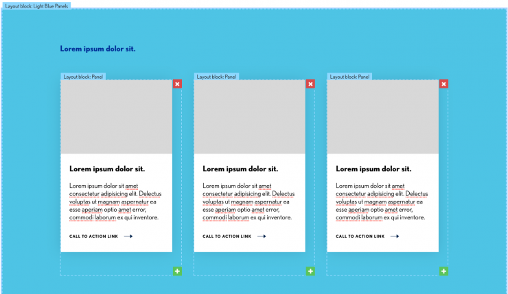
Note: it’s possible to change the color behind the panels to a set selection of colors. This requires editing source code.
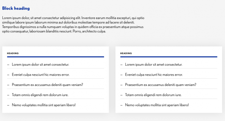
List Columns
This area has a heading, a paragraph, and two headings + lists beneath. You can add links to each list.
Instagram widget
This shows the latest posts from MMC’s Instagram account. You can delete it, if you don’t want it to show.
Prefooter Heading and Buttons
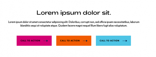
The last area has space for a heading, small text and 3 buttons.
The small text is already styled with the toolbar Formats > Small Text.
The links are styled as buttons with the toolbar Formats > Button (choose a color).
