Alumni Outcomes
Alumni Outcomes Guide
Blue Hero
The page title appears at the top. Go to Page Details > Edit page details to change the title.
Edit Page to change the introductory text that appears in the blue hero.

Alumni Spotlight Profiles
The next area shows 6 starred Alumni Spotlight profiles. If you star more than 6, random ones will appear each time you refresh the page. If you don’t star any, then it will show non-starred ones.
Go to the Dashboard, and switch to the Gateway: Alumni group.
Go to Profiles > Alumni Spotlight Profiles.
Select a profile to edit or +Add New.
Upload a photo at least 400px x 400px. You can use the crop tool to align the square crop over the right part of the photo (it appears in a circle on the website).
The first name, last name, graduation year, major and Spotlight Sentence appear beneath the photo.
When you click on the name, it takes you to the profile details page with the full Spotlight Story.

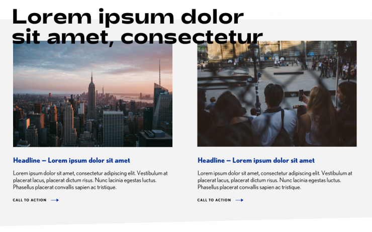
Top Stories
The next section shows top two stories tagged with top stories from the Gateway: Alumni group.
Edit the page to change the heading that appears above the two news stories.
To change the stories, go to the Dashboard, and switch to the Gateway: Alumni group.
Go to Stories and click a story to edit or +Add new story.
Fill out the headline, and summary, and tag the story with Top Stories.
Upload an image at least 900px x 600px.
Click the balloon to “Balloon” a story to the top.

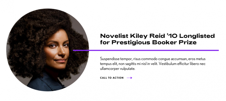
Starred Story
The next section shows a random starred story from the Gateway: Alumni group.
Go to the Dashboard, and switch to the Gateway: Alumni group.
Go to Stories and click to star the story. Don’t forget to add an image! (800px x 800px)

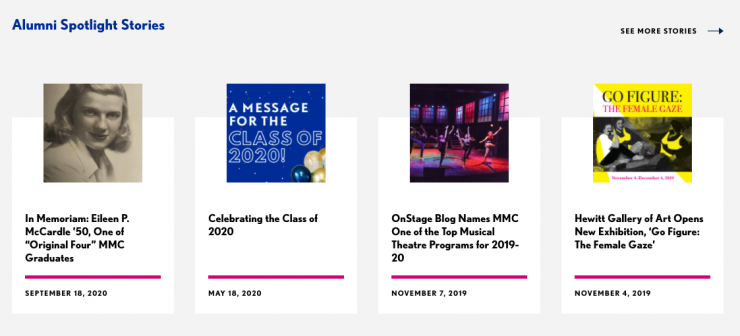
Alumni Spotlight Stories
The next section shows four stories from the Gateway: Alumni group.
Go to the Dashboard, and switch to the Gateway: Alumni group.
Go to Stories and click a story to edit or +Add New.

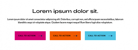
Prefooter Heading and Buttons
The last area has space for a heading, small text and 3 buttons.
The small text is already styled with the toolbar Formats > Small Text.
The links are styled as buttons with the toolbar Formats > Button (choose a color).
