Logos
There are three forms of the Marymount Manhattan Logo, and which one you’ll use depends on who you’re talking to, and how you’re doing it.
Please read the following guidelines before you download the logo.
Logo Types

Use the stacked version in external communications when there might be confusion on what MMC is. Also use this version when horizontal space is limited.


Practices to Avoid
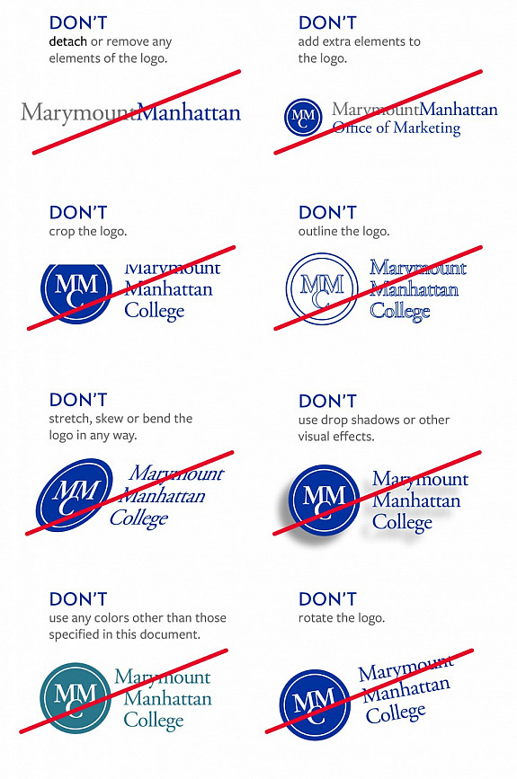
Do not redraw, modify, or embellish the logo in any way. This includes computer manipulations and animations.
Additionally, please follow these guidelines:


Logo color
Wherever possible, use the official blue versions of the logo you see above. Use the black logo when printing in black-and-white, and when only a single color is available, use the white logo on a colored background.
When using the logo over complex backgrounds, you should place it within a simple single-color shape like a rectangle, or use the all-white logo.
Minimum size
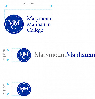
The minimum size allowed for use is 2 inches wide (for the stacked logo) or 0.5 inch tall (for the horizontal or circle logos). If you have a project in which the logo might be used effectively at a smaller size, you must obtain resized art and approval from the communications team.

LET IT BREATHE
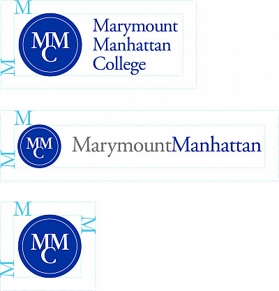
Graphics, photos, or text that run right up to the edge of the logo are unsightly and confusing—always keep clear an area corresponding to the height of one “M” letterform in the word “Marymount” or “Manhattan” (not the MMC lockup). It measures negative space around the logo in relation to text, photos, illustrations, or other visual elements.

Okay, I’m ready!
If you have questions, please contact: